I Judged Every Streaming Service by Its Home Screen and the Results Are Embarrassing for Everyone
Here's a thing that happens to me at least three times a week. I sit down, I open a streaming app, I scroll for somewhere between four and twenty-five minutes, and I close the app. I haven't watched anything. I'm somehow more tired than before I started. I go to bed a little resentful and wake up the next morning having dreamed about nothing in particular.
This is a design problem. Or maybe a psychology problem. Probably both. Either way, I started paying attention.
For about a week, I opened every major streaming platform cold — no specific title in mind, just me and whatever the algorithm decided to throw at my face — and I took notes. Not on the content, but on the experience of the home screen itself. The layout, the visual noise, the recommendation logic, the whole vibe. What made me want to click something? What made me want to throw my remote into the ocean?
Here's what I found.
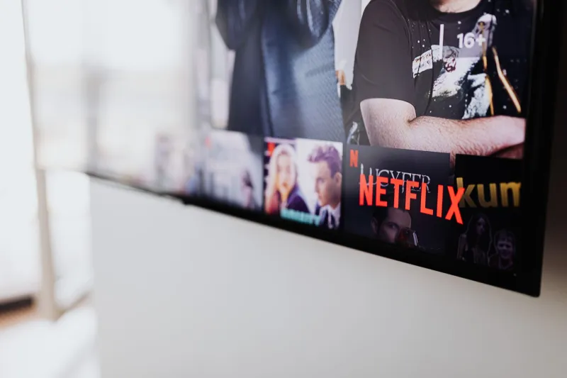
Netflix: The Confidence Is Almost Insulting
Netflix's home screen operates like that one friend who answers every question with total certainty even when they're wrong. The autoplay previews kick in before you've even processed what you're looking at. There's a giant hero banner, loud music, and suddenly you're being told that this is the thing you should be watching right now. No negotiation.
Sometimes it works. Sometimes you're already halfway into a trailer for something you genuinely didn't know you wanted. But more often, the sheer aggression of it makes me dig my heels in. I don't want to watch what the banner is selling me. Now I want to scroll past it out of spite, through row after row of "Top 10 in the US" and "Because You Watched" categories that are increasingly hard to argue with but also somehow feel like surveillance.
The UX is slick. The visual hierarchy is clear. But Netflix's home screen has the energy of a pushy salesperson who's very good at their job, and sometimes you just want to browse in peace.
Home screen verdict: Confident to the point of being slightly annoying. Effective anyway.
Hulu: The Chaos Gremlin of Streaming
I genuinely don't know what Hulu is trying to tell me when I open it. There are tabs for Live TV and there are tabs for Hulu Originals and there are things that are definitely ads even though I'm paying for the service and there's a row of content that seems to have been curated by someone who just grabbed random things off a shelf.
Hulu has a lot going on. Too much, probably. The home screen feels like a website that was designed by three different teams who never spoke to each other. The recommendations don't feel particularly personal — they feel more like "here are things that exist on Hulu" rather than "here are things we think you specifically might enjoy."
I'll say this: Hulu is the platform where I'm most likely to stumble onto something unexpected. Not because the algorithm is good, but because the chaos occasionally throws something interesting into my path by accident.
Home screen verdict: A beautiful disaster. Lower your expectations and you might find a gem.
Disney+: Built for a Specific Energy and Knows It
Disney+ has the cleanest home screen of any platform I looked at, and it's because it's essentially operating in a niche. You're here for Marvel, Star Wars, Pixar, or classic Disney. The interface knows this. It doesn't try to confuse you with a thousand directions. The visual design is polished, the categories make sense, and the autoplay previews are less aggressive than Netflix's.
The problem — and it's a real one — is that if you're not in the mood for any of those things, the home screen has nothing to offer you. It's like walking into a very well-organized store that only sells one type of thing. Great if that's what you want. Completely useless otherwise.
I also noticed that Disney+ has a way of making everything feel like an event, which sounds like a compliment but can actually create its own kind of paralysis. Everything is presented as essential. Everything has a glowing logo treatment. At some point your brain just flatlines.
Home screen verdict: Polished and purposeful, but narrow. Works great until it doesn't.
Max: The Identity Crisis Is Visible From Space
Max — formerly HBO Max, formerly just HBO, currently whatever it is now — has a home screen that feels like it's still figuring itself out. There's prestige TV sitting next to reality competition content sitting next to theatrical releases sitting next to stuff that feels like it was acquired just to fill space. The brand promise of "quality" is right there in the legacy of HBO, but the home screen doesn't always reflect that.
That said, when Max's recommendations land, they land. If you've been watching a certain type of drama, it gets the assignment. The interface has improved meaningfully over the past year, and there's a sense that someone is actively trying to make it less of a mess. I respect the effort.
Home screen verdict: In progress. Check back in six months.
Apple TV+: The Minimalism Is Either Zen or Terrifying
Apple TV+ has so little content compared to its competitors that the home screen is almost meditative. There's the new thing. There's the thing from last month. There's the critically acclaimed thing you've been meaning to watch. That's mostly it. The design is immaculate — very Apple, very clean, very "we know exactly what we're doing" — but scrolling through it takes about forty-five seconds before you've seen everything.
Paradoxically, this is the platform where I feel the least paralyzed. The choice is limited, so the decision is easier. Pick something or don't. There's no abyss to fall into.
Home screen verdict: Accidental genius through limitation.
The Actual Problem Nobody Wants to Say Out Loud
Here's the thing I kept coming back to as I went through all of these. The home screen isn't really the enemy. The home screen is just the place where a much bigger problem becomes visible.
We have too many options. Not just too many streaming services, but too many options within each service. The entire model is built on the idea that more content equals more value, but human brains don't work that way. More choices create more friction, not less. There's a reason people describe the streaming experience as exhausting — it's because it genuinely is.
Every one of these platforms is trying to solve the same problem: get you from "I want to watch something" to "I am watching something" as fast as possible. Some are better at it than others. None of them have fully cracked it.
In the meantime, I'll be on my couch, opening and closing apps, building character.